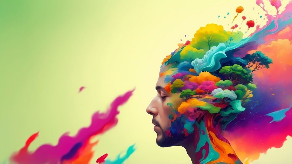
Color is one of the most powerful elements in design. It affects how people feel, react, and remember what they see. Whether it’s a dress or a room, color has the power to change mood and meaning. That’s what color psychology in design tells us: how every shade influences emotions and experiences across both fashion and interiors.
Red: The Color of Energy
Red is bold and full of life. It stands for confidence, celebration, and passion. In fashion, red clothes instantly draw attention, while in interiors, red brings warmth and vibrancy to spaces like cafes and living rooms. Through color psychology in design, red is known as the shade that excites the mind and makes a strong impression.
Blue: The Shade of Calm
If red feels energetic, blue feels peaceful. It creates a sense of trust, calm, and focus. Designers often use blue in both clothing and interiors to inspire relaxation. Light blues bring freshness. while darker tones add depth and stability. According to color psychology, blue helps people feel more grounded, which is why it’s seen everywhere from denim fashion to modern offices and bedrooms.
Other Colors and Their Moods
Each color tells its own story. Yellow spreads joy and optimism. Green connects to nature and balance. Black is timeless and adds sophistication, while white represents purity and openness. Color psychology in design reveals how the right color combinations can transform a space or outfit, making it feel anything from bold and dramatic to calm and inviting.
Jaipur’s Color Heritage
Jaipur, famously known as the Pink City, shows how color can define identity. The city’s pink walls were first painted to welcome royalty but became a long-lasting symbol of warmth and friendliness for the city. Crafts from Jaipur, like block printing, tie-dye, and gemstone work, reflect the deep connection between color and culture. Jaipur’s pink perfectly shows color psychology in design, creating a cheerful and welcoming feeling that lasts even today.
NIF Global Students: Learning Through Color
At NIF Global, students learn how colors communicate emotion and culture. Many projects blend traditional Indian color techniques with modern design ideas from pastel fabrics inspired by Jaipur’s summer tones to interior spaces that balance cool and warm shades. These projects show how students apply color psychology in design to create work that feels human, expressive, and rooted in culture.
The Takeaway
Color is more than decoration, it’s emotion made visible. It shapes how we experience both fashion and space. Understanding color psychology in design helps every creator make choices that connect with people’s feelings and stories. From the energy of red to the calm of blue, and from Jaipur’s pink heritage to modern design classrooms, color keeps reminding us that design isn’t just something we see it’s something we feel.
Leave a Reply