Color is one of the strongest tools a designer has. It shapes mood, defines personality, and determines how a design is experienced. For design students, understanding trend-based color combinations is not about blindly following what is popular. It is about learning how color pairings influence perception, balance, and emotional response.
When colors are chosen with intention, even a simple design can feel refined and thoughtful.
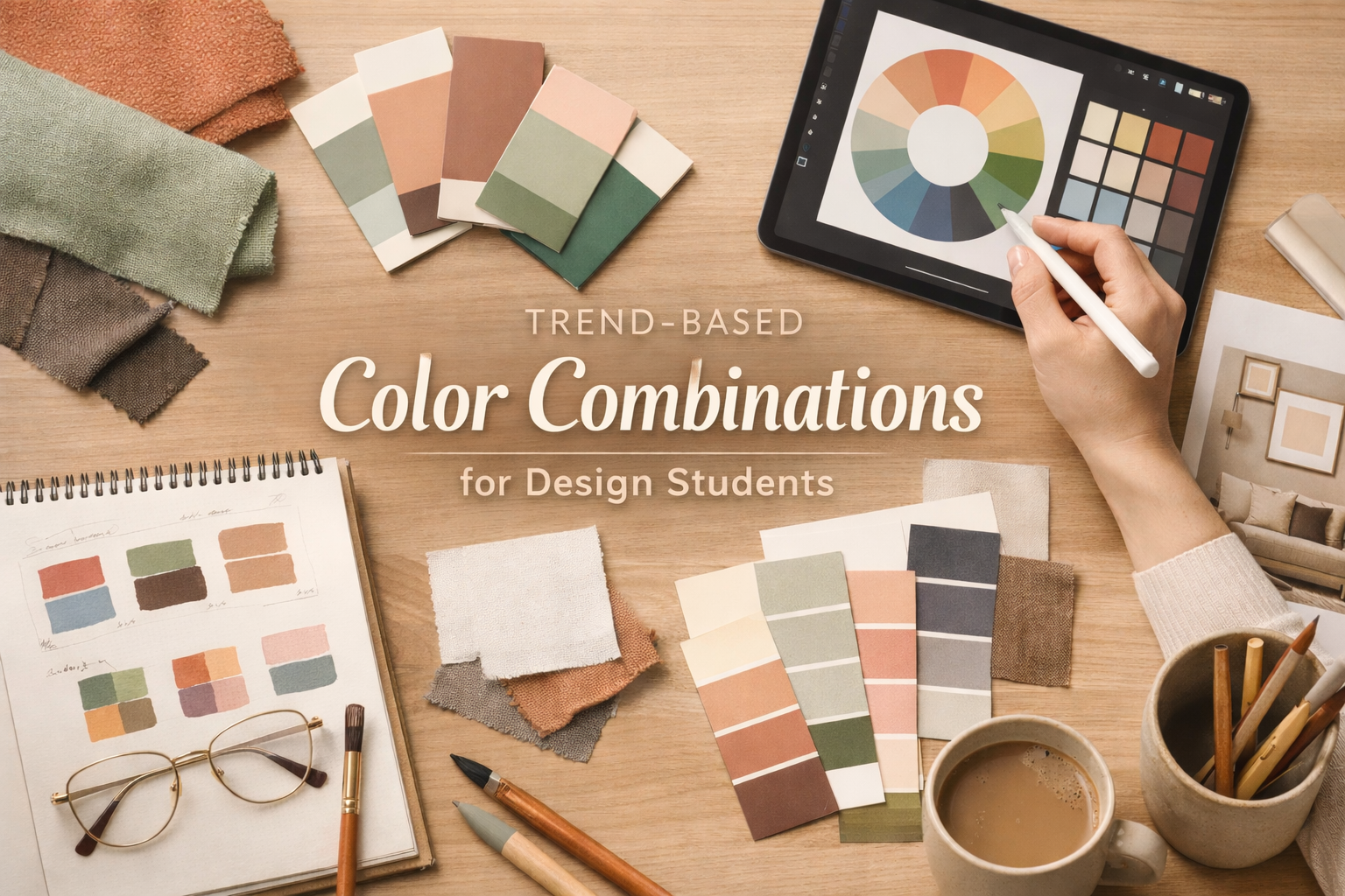
Why Colour Trends Matter in Design
Trends reflect how society feels at a particular time. Shifts in lifestyle, technology, climate awareness, and culture all influence the colors people are drawn to. As a student, studying color trends helps you understand what feels current and why certain palettes resonate more than others.
This knowledge improves your aesthetic judgment. Instead of guessing, you start making informed decisions that feel relevant and confident.
How Trend-Based Colour Combinations Shape Design Outcomes
Color combinations affect how a design is read. High-contrast palettes feel energetic and bold. Soft tonal palettes feel calm and sophisticated. Balanced combinations create harmony and visual comfort.
When you apply trend-based color combinations correctly, your work looks more intentional. It shows that you understand proportion, hierarchy, and mood, not just color theory in isolation.
Popular Colour Directions Designers Are Using Today
Current design trends favor palettes that feel grounded, expressive, and versatile. Some common directions include:
- Earthy bases with soft accents, such as clay tones paired with muted greens or warm creams, create comfort and stability.
- Muted pastels with deeper anchors, where soft blues or blush tones are balanced with charcoal or brown to avoid looking flat.
- Monochromatic palettes, using variations of one color to create depth through shade and texture instead of contrast.
These combinations work across fashion, interiors, and visual design because they feel adaptable and modern.
Using Colour Trends Without Losing Originality
One mistake students make is copying trending palettes without adapting them. Trends should guide your choices, not replace your design thinking. Always ask why a particular combination works and how it supports your concept.
For example, a warm neutral palette may suit a calm interior space but feel lifeless in a bold fashion collection. The same colors behave differently depending on context, material, and scale.
How to Practice Colour Pairing as a Student
Start by observing how colors appear together in real spaces, clothing, and digital layouts. Collect references and study how designers balance dominant, secondary, and accent colors.
Then experiment. Create small studies using limited palettes. Test how a design feels when one color is replaced or softened. This hands-on approach builds confidence far faster than theory alone.
Common Mistakes to Avoid
Avoid using too many colors in one design. Overloaded palettes confuse the eye and weaken impact. Another mistake is ignoring lighting and material. Colors look different on fabric, walls, screens, and paper. Always test combinations in their intended context.
Why Colour Sensitivity Builds Better Designers
Designers who understand color deeply make stronger decisions across every discipline. They know when to hold back and when to add contrast. They recognize when a palette supports the message and when it distracts from it.
By studying and applying trend-based color combinations thoughtfully, you train your eye to see balance, emotion, and intention. This skill carries forward into every project you create.
Key Takeaway
Trends are not shortcuts. They are signals. When you study them carefully and apply them with purpose, your work gains clarity and confidence. Use color as a language, not decoration, and your designs will communicate far more than visuals alone.
Leave a Reply